QALA mobile
One insurance app for two companies. Customers of Qala Həyat and Qala Sığorta buy, sign, pay and claim from a single place.
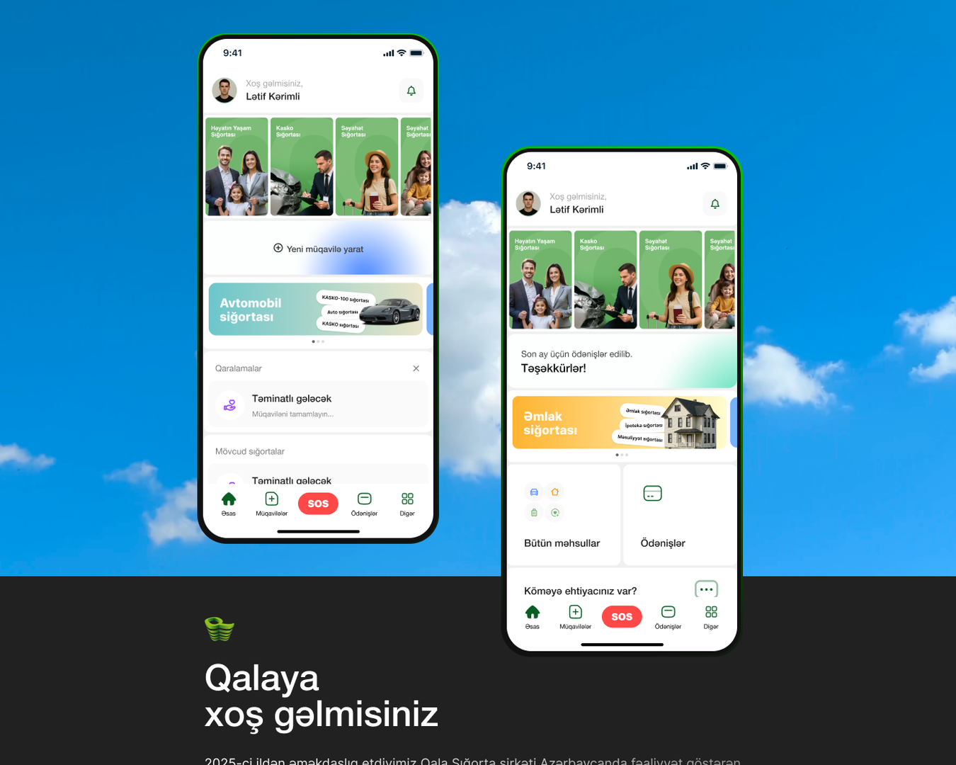
Two brands, one customer.
Qala Həyat has sold life insurance in Azerbaijan for 15 years. Its sister company Qala Sığorta covers cars, property and travel. Many customers hold policies with both, yet each company ran its own website, its own hotline and, until 2020, its own app.
In 2025 SAFAROFF was engaged to rebuild the whole digital layer: two public websites, two customer portals and one mobile app shared by both brands. I led design across all five. This page covers the app, which had the hardest brief: discover products from either company, buy the ones that can legally be sold online, sign with a qualified digital signature, pay premiums on schedule and report an incident, and feel like one product rather than two apps stapled together.
Regulated, sprawling, and used under stress.
- Two logics, one account. A life contract runs for years with monthly instalments and a legal signing ceremony. A travel policy is bought in a minute and expires in a week.
- Regulated sales. A contract is valid only after signing with SİMA or Asan İmza, the state digital signature services. Life products add a CRS tax questionnaire and identity documents. Nothing could be skipped.
- Product sprawl. Motor, KASKO, Green Card, property, mortgage, domestic and international travel, eight special products, seven life products, each with its own tariff rules.
- Payment discipline. A missed instalment can freeze cover. Customers need to know what is due and when, not read a ledger.
- Emergencies. A customer standing next to a damaged car must not hunt through menus.
A contract-centric app with an always-visible emergency path.
Reading the 40+ client documents, every one of them resolved to a contract with a status: draft, signed, active, payment required, expired, terminated. So the app was built around contracts and their states, not around brochures.
- Five tabs, one of them red. Home, Contracts, SOS, Payments, More. SOS is the only element that breaks the green palette, so it reads as an emergency control even on first use.
- Brand as a filter, not a split. One catalogue with three chips: All, Qala Həyat, Qala Sığorta. Categories show their product counts so the range feels finite.
- Guest first, identity when it matters. Browse and get a quote without an account. FİN code, documents and the CRS questionnaire appear only when a purchase needs them.
- Statuses in plain language. Green for paid and active, orange for payment required, grey for expired. The same vocabulary runs through both customer portals.
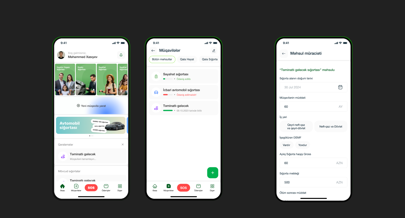
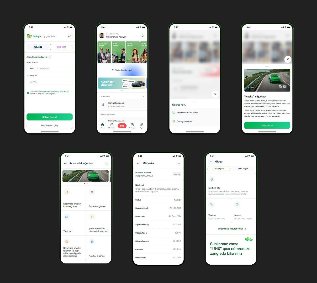
Sign in, buy, pay, report.
- Sign in with SİMA or Asan İmza, or continue as a guest. The SİMA path explains the three steps before the camera opens, because the hand-off to another app is where a sale is won or lost.
- Buy travel insurance in one screen per step: destination, dates, companion, purpose, premium, consent, sign, pay.
- Pay a premium from a countdown on the Payments tab, with saved cards and a clear retry on failure.
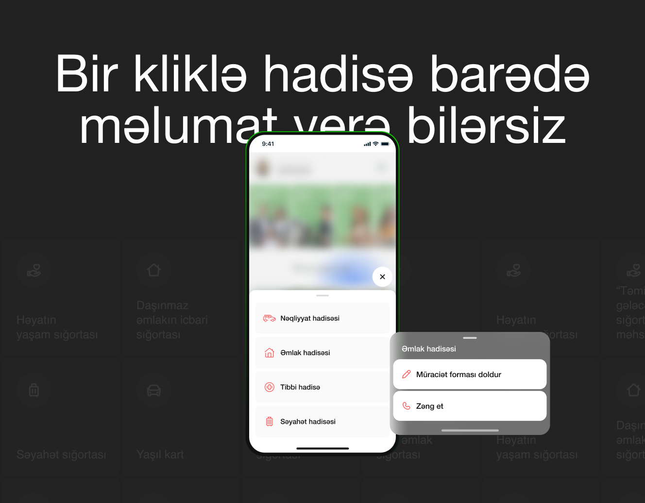
- Report an incident from SOS: vehicle, property, medical or travel, then fill the form or call the hotline.
On the App Store and Google Play.
Published as QALA mobile by Qala Life Insurance Company OJSC on 14 January 2026 and iterated in production to version 1.1.4 by October 2026.
Four calls that shaped the product.
The contract is the unit, not the product
Every client document ended in a contract with a state. Building the app around contracts and their statuses made most screens design themselves and kept the two portals consistent with the app.
Design the hand-off to the signature app
Signing happens outside the app, in SİMA. Instead of a system dialog, that moment got its own explained screen, because it is exactly when money changes hands.
One red button
SOS is the single element outside the green palette and sits in the middle of the tab bar. Claims happen under stress, so the emergency path never moves.
Countdowns, not ledgers
Payments show "29 days left" or "payment required" the moment the app opens. Grace periods and overdue rules from the client's documents became two words and a colour.
Five products, one design language.
Both websites, both customer portals and the app share one system: Qala green as the single accent, white cards on a light canvas, one icon family and one set of status colours. A customer who starts a contract on the web and signs it on the phone sees the same names and states throughout. The client's launch campaign promised renewal of compulsory motor insurance in two minutes from the app.
What I would do differently. Test the CRS questionnaire with real customers earlier. It is the longest form in the app and the one most likely to be abandoned. And agree on how guest-to-customer conversion is measured before launch, so the next iteration is driven by data.